Wednesday, September 14, 2016

drunk dictation

During summer I wanted to focus on the investigation of languages which would illustrate the common errors in student writing especially mines. That project would had focus on the use of typography and communication as well as furthering tighten my concept of languages. Although I have scrap that Ideal I will still be using the same structure as before but with a different topic....

Drunk dictation branched off from a Using Images project that focused on making posters THAT REPRESENT MY FAVOURITE ALCOHOLIC BEVERAGES WITHIN BEVERLY, ROSELLE, AND CHINATOWN this help me create my seminar project which will focus on the languages as well as the speech of each victim who is under the influence.
Alcohol can affect many parts of the brain  in which we will focus primarily on the control of speech. The alcoholic effect on speech leads to familiar signs of drunkenness: such as slurred speech, memory lapses and impulsive behavior.  Within these fragmented conversations, will reveal how languages will be perceived under the influence and also their abstracted speech patterns.


Mood Regulation
Almost everyone that drinks alcohols, mood get regulated in some way or form. Alcohol can put someone in a certain mood or maintain an existing one, even if it is unintentional. In such a case some people actually use alcohol to escape from the state where they can  barely tolerate to a state that makes you feel better. 

With the mood chart, I actually need help in deciding on at least 15 moods to showcase for this project . Right about now I have 60. Which is overwhelming.


Later I would include a chart that would show a visual interpretation of how alcohol  change the mood of different victims undergoing the process of mood regulation.

BAC CHART - I did not design the chart below 


Tuesday, September 13, 2016

Test Run

Over the past few days I've watched many tutorials on 2D and 3D modeling. While experimenting and learning software, I saved the following images.


This image is a bit larger to show detail.


The Elements of Typographic Style, Robert Bringhurst

John suggested that I look into the book, The Elements of Typographic Style for the start of my thesis project.

Throughout this semester I am going to use Robert Bringhurst's "rules" of typography but go against those rules to create something experimental.

I have decided to experiment with the word Bringhurst and do a word play exercise with that word.


the third floor walls, more

topics so far —

  1. revisiting 2D Design.
  2. design as relational aesthetics.
  3. fear. phobias.
  4. books, our relationship with books.

On Monday, prompted by Adela's presentation about books and book covers, we discussed some ideas relating to books and our personal relationship with them. Favorite books, books that we perceive as being significant in our lives, or that in important ways mirror us to ourselves.

John described a project in his section of Forms and Cultures of the Book, and described in that course website here. In brief —

  1. Curate a presentation of books (8 to 12) that have meant something to you, or animated you, or that you aspire to read, or that you wish had been written, or that you once owned but lost, or that you hated, or that you’ve borrowed and never returned, or, or, or.
  2. Create a catalogue that lists and describes each of these books, shows a page from each, and discusses its importance to you.

John was more interested in our relationship with books, than in books themselves. He showed the pdf of his uncompleted version of that project (entitled Book Marks), and also discussed a related idea of inviting Montserrat faculty (and potentially others) to select eight-ten books, that would be exhibited in the library along with their owner/selectors' comments thereon, and involving an in-person presentation.

Special 24x24 inch book units, divided in four quadrants each 12x12 (or some other dimension), would be fixed to the wall. If three faculty, then three such units.

This led to a discussion of how we might ask instructors (or others?) to name those books that have meant the most to them, and do something with this. We'll return to this thread tomorrow (Wednesday).

Another theme was also proposed — fear, or phobias. Several seminarians had taken the Fear course last year. How might this theme be approached or handled, for us as designers? The idea of representations of specific fears/phobias comes immediately to mind; this would tend to cast the exercise as one of illustration. Yet the overall design of the exhibition, its idea, the curation itself, all are design.
 

note taking, 清

A reminder that designated note-takers are responsible for recording the discussions of students during class, and sending these to that student (with a copy to the instructor) before the end of the same day. Here are the initial assignments (these will change as we move through the rotation).

For our first day, notetaking was as follows —

Alexandra, notes by Taylor
Adela, notes by Li Yun
Taylor, notes by Adela
Li Yun, notes by Lauren
Katie, notes by Ziyi
Ziyi, notes by Britney

We will complete the first cycle tomorrow Wednesday.


clear, clean, distinct, quiet
google translation
thanks Li Yun
 

Monday, September 12, 2016


Okay!

So I think I'm going to do what was recommended to me in class on Wednesday and still post on my own blog some of my ramblings and other projects, and then post stuff more directly related to my Thesis on here.

That being said, if you're interested in seeing my posts on my other blog here's the link: https://alexandrabonin.wordpress.com/blog/

In going with the suggestion to make movie posters for things that aren't movies, here's a poster I was working on with the school as the subject for it.


Not my finest work, but it was an experiment. This week I will experiment more with making posters for things that aren't movies.

However, I guess this brings a question in mind, what makes a movie poster different from a regular poster? I guess I need to do some more studying up on this, because I suppose the simple answer could be formatting and the copy that is on it (the credits at the bottom, release date, etc.), but is there a more complicated answer to this? And does this even matter, is it important? I dunno, just some things to think about and research (while still making work)

Sunday, September 11, 2016

Picking Up Where I Left Off

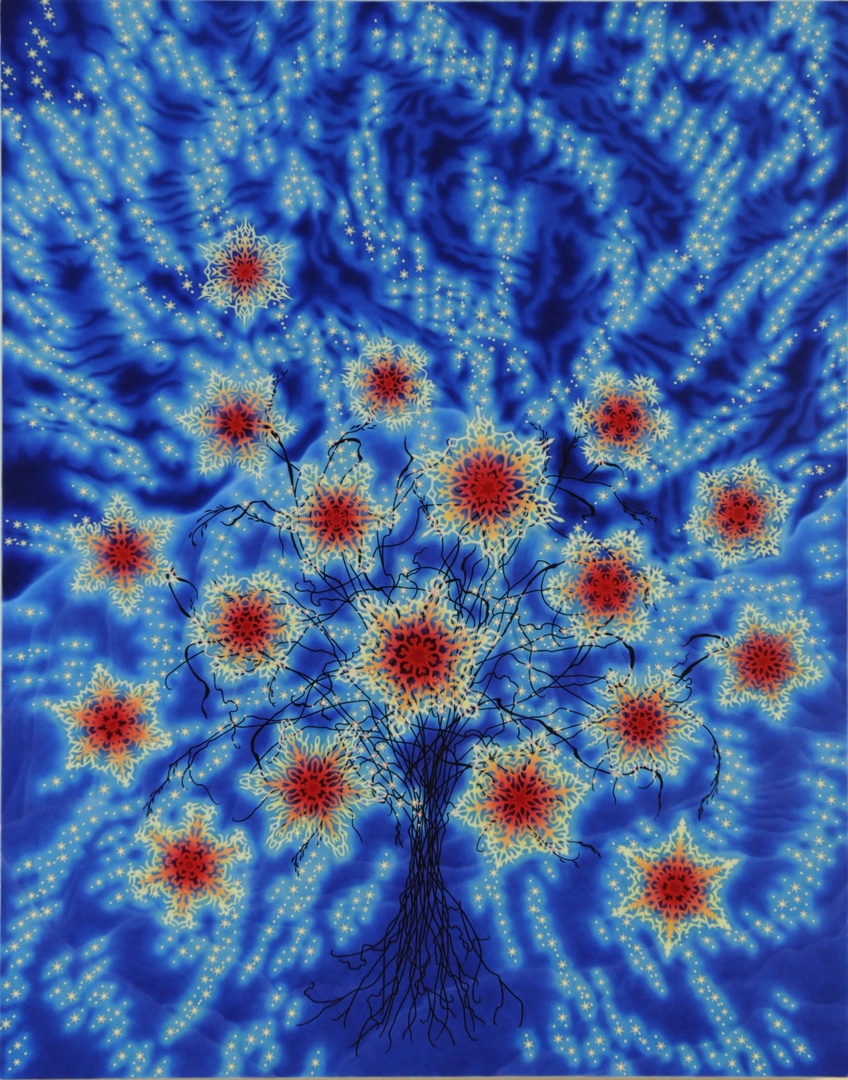
Over the summer I went to MASS MoCA and had the opportunity to look at pieces by Sharon Ellis (pictured below). I was captivated by the vibrant colors and I really appreciate how these are hand painted because up until this point all of my work has been designed digitally. This, along with crystalline sculptures by Leah Piepgras, are just an idea of what I've been looking at.


Last semester I grew my own crystals and a question was brought to my attention as to whether they were considered a part of nature or not because I had grown them myself (they didn't occur naturally). I've decided to take this a step further and alter these structures I've created through 3D modeling software. I want to recreate and hopefully print them, showing a defined transformation in their form and composition from "natural" to "designed". I've started this process by examining various modeling software, and I've been given the opportunity to attend a 3D printing workshop later this week.